Accessibility, usability and inclusion on the Contact website
Thursday 31 October 2024
As part of Contact’s continuous improvement programme for accessibility and inclusion, we’ve been updating our site to make it a better experience for our website visitors.
In this article
Why accessibility, usability and inclusion is important
Accessibility, usability, and inclusion are closely related aspects in creating a web that works for everyone. For Contact, accessibility means that people with disabilities can equally perceive, understand, navigate, and interact with our website and tools. And we want our site to be inclusive to everyone, which is why we write in plain English and have a translation tool so that users can select the language that they’re most comfortable with.
Recite Me accessibility toolbar
A small but important update to our accessibility toolbar – instead of “Accessibility toolbar” it’s now “Accessibility & language”. This means it will be clearer to users that our accessibility toolbar (Recite Me) includes language options.
If you’re not familiar with the Recite Me – it’s a cloud-based assistive technology toolbar which provides a more digitally inclusive experience by allowing visitors to customise content so that they can consume it in ways that work best for them. The toolbar includes a translation option, page summary tool, screen reader, and visitors will be able to customise the website’s colour scheme as well as the text, font style, size, colour, and spacing.
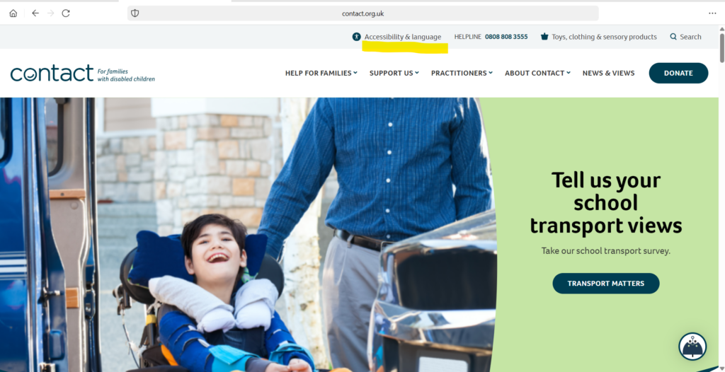
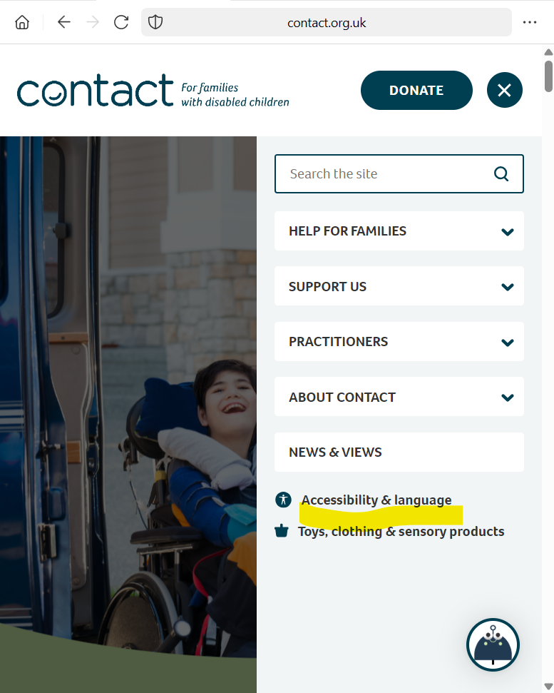
Below are a couple of screenshots showing where you can find the “Accessibility & language” link to open the Recite Me toolbar (underlined in yellow highlighter):
Desktop view

Mobile view

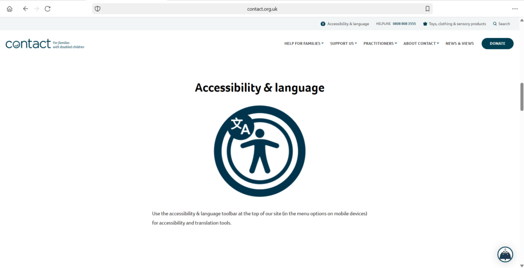
Accessibility information on our home page
We have clear sign posting to our accessibility and language toolbar on our home page – scroll down and you’ll find it just under the latest news and views section.

Focus styling
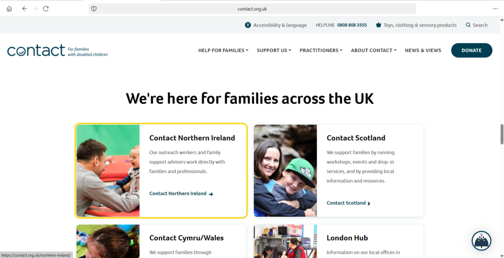
We’ve updated our focus styling from a thin dashed line to a thick yellow line – visitors to our site can see the focus styling when they click on an interactive part of the page (eg link or a button). This updated styling means it is easier for everyone to see where they’re at and know what they’re clicking. You can view the updated styling anywhere on our website where there’s a link or a button! This styling is applied for all types of devices and browsers.
If you’re interested in finding out more, take a look at this article about focus styling >
And here’s a screenshot of the styling on our home page – the focus styling is around the Contact Northern Ireland block:

Find out more
Visit the Recite Me website to find out more about the Recite Me toolbar >